 This article originally appeared in the May 2017 edition of the APWA (American Public Works Association) Reporter on page 50. You can access that publication here.
In local government, and especially within Public Works, we often struggle to “toot our own horns”. Whether due to lack of time, resources, or effective communication skills, this is clearly a missed opportunity and could become a liability in the future.
At the same time, we’re in the midst of a global trend where citizens are demanding transparency, accountability, and pathways to participation from government agencies. Our attempts to accommodate these requests are creating more demands on our already overburdened staff and forcing communication without necessarily having a clear strategy for doing so- think of that Facebook page that you make the interns keep updated.
There is a better way to address both of these challenges. While it will require a little upfront effort, it will save significant time and possible headaches in the long run.
So, what is this silver bullet?? DATA! Yes! All the engineers out there will love to hear that the answer to the challenges above is data. BE CAREFUL THOUGH, in the age of transparency we must ask ourselves, “Is dumping data on a website really transparent and inclusive?”
Most people in our communities aren’t data geeks or engineers, nor do they have the time to sift through charts, reports, meeting agendas, and notes. Just because you make data available doesn’t mean it’s actually accessible. You need to turn your data into a story and that story can help you highlight your successes. You may even discover that your community is well on its way to a more sustainable future.
There’s a story in those data points.
As local government staff and officials, we collect tremendous amounts of data. From miles of bike lanes and storm drains to tons of recyclables and million gallons of wastewater, public works staff is very familiar with data collection.
Most people in our communities, however, are not immersed in the intricacies of our daily work -- they just know they want clean air for their kids to breathe, urban spaces that are safe for families to enjoy, and easy access to transportation options.
Does that mean all the quantitative data -- and the effort that goes into collecting it -- is for naught? On the contrary, we just need better tools to turn that data into a compelling story.
Here are some simple guidelines that can help you effectively tell your story with data whether it is for a presentation, your website or social media pages, or a brochure or flyer that you are sending out to the community.
- Provide Simple Explanations and Avoid Technical Jargon
Why is this Important?
- 50% of adults in the US cannot read a book that is written at an 8th grade level.
- Technical jargon will only confuse people, and make them uninterested.
How to Do It
- Focus on WHY your community members should care about this information. Remember, they don’t know all the details that you do, so try to see it from their point of view.
- What benefit or impact will it have on them personally?
Resources
Not sure how to communicate at a 6th grade level? Check out these example sites.
- Use Images, Icons, and Infographics
Why is this Important?
- As mentioned above, 50% of adults in the US cannot read a book that is written at an 8th grade level and 14% are illiterate.
- For many of our community members, English is not their first language and their engagement and input is important to truly understand the full needs of your community.
- You can connect with these groups and others far easier through the consistent use of logos, icons, and images.
How to Do It
- Images or infographics that can put the data into perspective- i.e. the new water conservation program will save the equivalent of 20 Olympic size swimming pools each day.
- Icons are a great way to showcase different functions within a community. Below are some examples developed for the City of San Antonio, TX’s Sustainability Plan project (you can see the full set here). These icons are seen throughout the plan and were also incorporated into their online sustainability dashboard to ensure consistency.


Resources
There are lots of online resources available now to help you develop logos, icons, and infographics. Here are a few that I use:
 design a logo for your organization, department, program, etc.)
Infographics (Canva and Pikto Charts)
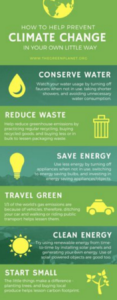
Here is an infographic template I pulled right off Canva for free. This could be used completely as is, but the site will let you add your own logo, colors, and other design elements.
Put Data into Context
Why is this Important?
Data can only tell an effective story when we provide context and comparisons. A single data point on its own tells us very little.How to Do It
Make sure you have more than one year of data and where possible data from other communities or the state or national average to compare with.Resources
- StarCommunities.org is a rating system that provides a framework for sustainable communities based on hundreds of data points within eight different goal areas. There are 59 local governments that have completed the STAR assessment process and their data is available on the STAR website.
Example of Applying Context and Comparison to Data
*Okay* Our Recycling Rate is 42%- provided data, but no context or comparison
**Good** Our Recycling Rate this year is 42%, three years ago, it was 37%- provided data, and self-comparison, no context
***Great*** Our Recycling Rate this year is 42%, three years ago, it was 37%. The US national average recycling rate is 34%- provided data, self-comparison, and context
- Include Calls to Action
Why is this Important?
- If you are going through the effort of pulling data together to demonstrate
 progress and be transparent with your community, why not invite them to be part of your success story while you have their attention?
How to Do It
Identify easy actions for your community members to take that might help improve your outcomes. Sticking with the recycling example, you could ask them to try composting or provide them additional guidance on what can be recycled and challenge them to improve their own recycling rates.Resources
- In addition to the local programs that you are probably familiar with, there are many regional and national resources that can help your constituents be part of the action whether through actual program participation – such as volunteering for Keep America Beautiful - or by offering simple tips like how to successfully compost in the backyard.
The culmination of these steps is the framework for a great story that can promote your successes to the public and your elected officials, track progress on your metrics and goals, and engage your community members. Here is a view of the framework in another way.
- Why We Care
- What it Looks Like
- Our Baseline and Current Data and Other’s Data- (this is also a great place to indicate any goals that have been established)
- What You Can Do to be Part of the Solution
Planning. Tracking. Reporting. Engaging. Celebrating. All under one roof.
Once you have pulled together your data, you may want to utilize an online dashboard to show it off. Local governments across the US and Canada are using dashboards- either developed in-house or working with a consultant- to track and report progress; conduct planning exercises; collect feedback; and drive the target audience to take desired actions.
That last part is critical when it comes to community sustainability where your job isn’t just to inform people. It’s to get them to be part of the solution. And by “them,” we mean all walks of life not just the usual suspects. To that end the data must be accessible and actionable.
Marrying the story telling framework outlined above with an online engagement tool can be a win-win for any organization. If you want to learn more about how Nashua, NH successfully did this, be sure to check out our session at PWX on Monday, Aug 28 from 9:45 AM to 11:00 AM.


